
Designing an Accountability-Driven Health Tracking Experience to Support Lasting Health Change
My Role: Product Designer
Client: Prime Care Limited (Simulated)
Context: Product Design Postgraduate Project, King’s College London
Timeline: 2 Month Lean UX Sprint
Tools: Figma Design, Figma Make, Figjam, Miro, Claude AI, Midjourney AI, Usability Testing, competitive analysis, usability testing, journey mapping, hypothesis testing
Team: (Simulated) Product Manager, Product Designer, 2 Front-End Developers, 2 Back-End Developers, Data Scientist, DevOps Engineer
Stakeholders: (Simulated) Product Leadership, Product Design and Research, Engineering and Infrastructure, Data and Analytics
20-35%*
*Projected uplift in long-term feature adoption
20-40%*
*Projected uplift in Monthly Active Users
15-30%*
*Projected uplft in user retention
91.25%
System Usability Scoring
96.43%
Ease-of-use scoring (SEQ)
100%
Task Completion Rate
Introduction
Health Hero is a simulated early-stage digital health product designed to help users build healthy habits through goal-setting and points-based reward systems.
Prime Care uses monthly active users as their North Star metric and target users are health conscious adults, many managing chronic health risks.
My Role
As the Product Designer, I undertook research to understand the core root causes underlying this feedback.
This would be achieved through a mixture of research processes of evaluation, identifying improvement areas and providing evidence-based insights.
The Challenge
The redesign project was initiated in response to recurring user feedback issues
Lack of effective progress tracking that felt unresponsive
Progress tracking not reflective enough of actual user progress
No way to compare past and future metrics.
The Goal
My goal was to guide the implementation of adaptive progress and reward mechanisms in alignment with the user's preferences.
This would in turn support Prime Care's organisational goals of increased user retention, acquisition and monthly active user engagement.
The Team
Product Manager, Product Designer, 2 Front-End Developers,
2 Back-End Developers, Data Scientist, DevOps Engineer
Our Stakeholders
Product Leadership
Product Manager responsible for defining product vision, roadmap, and cross-functional alignment
Product Design and Research
Product Designer responsible for UX research, interaction design, and user experience strategy
Engineering and Infrastructure
Front-End Developer responsible for user interface implementation and usability
Back-End Developers responsible for system architecture, performance, and security
DevOps Engineer responsible for scalability, reliability, and deployment infrastructure
Data and Analytics
Data Scientist responsible for behavioural insights, usage analysis, and feature value evaluation
My Design Process
An iterative, research-led design process with two cycles of discovery and validation.
Problem
Problem Definition
Discover
Define
1
2
Design
3
Deliver
4
Solution

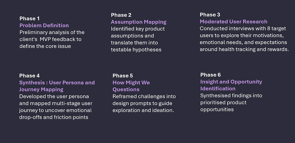
Research Methodology
To address the challenges users faced with progress tracking and motivation, I conducted a structured UX research process aligned with PrimeCare’s goals.
My process has six steps, resulting in strategically informed opportunities for design concepts and feature development.
Moderated User Interviews
Building on this research methodology, I conducted moderated exploratory interviews to address the problem defintion.
Users disengage before achieving desired outcomes, as the product does not sufficiently support the behavioural drivers that sustain long-term adherence, and lacks clarity on which mechanisms sustain this..
This research focused on identifying what motivates continued health habits and how product design can support lasting behaviour change.
Problem Definition
Research Purpose
Research Synthesis
Analysis of the interviews revealed that participants struggled to maintain motivation when tracking habits independently. While many described social support as strong motivators in other areas of life, these were absent from their health tracking experiences.
This suggested that incorporating accountability features may play a meaningful role in supporting sustained behaviour change.
User Persona
I created a user persona- 'Charlene', to deepen my understanding of the target demographic's needs and pain points.

User Needs
Stay motivated to return to the platform regularly through supportive accountability and meaningful progress feedback
Quickly understand how to support her health goals and why engaging with it regularly benefits her
Build consistent health tracking habits that fit seamlessly into daily life
•
•
•
Visualising The User Journey
Visualising the User Journey
To translate user needs into practical interaction pathways, I mapped user task flows for the proposed feature.
Happy Path Type A
Maps the ideal journey of inviting and adding an accountability partner.
Alternative Path Type B
Mirrors the same flow but includes invite errors and recovery steps. Modelling both scenarios helped assess implementation feasibility and define the stages required for wireframing and design.
Happy Path Type A
Inviting Your Accoutability Partner Process

Alternative Path Type B
Accoutability Partner Invite Error Messages

Mid-Fidelity Wireframing
Habit Partner Onboarding Flow
I developed interactive mid-fidelity wireframes to prototype the new habit-sharing accountability feature within the MVP. These wireframes helped define key interaction steps and structure how information should be presented to support a smooth onboarding experience.


Moderated User Testing
I constructed a set of research questions to evaluate the new product feature's perceived desirability and value potential to motivate and consistently retain the monthly active user base.
I measured the outcomes through quantifiable effectiveness, efficiency, and satisfaction metrics that were relevant to both user and organisational goals. Afterwards, I proceeded to conduct the moderated usability study.
Research Validation
All participants expressed interest for the feature and found it to be relevant for preferences to varying degrees.
They self reported in the wrap-up questions and survey ratings high to moderately high frequency and likelihood of continued use in the future.
Addressing Usability Issues
Usability findings revealed several areas where clarity, trust, and interaction design could be strengthened.
Prototyping
Habit Partner Onboarding Flow
Following prioritised usability findings, I translated key insights into a refined high-fidelity prototype. Using the tested mid-fidelity wireframes as a foundation, I implemented targeted design improvements to address clarity, trust, and interaction issues.
This phase introduced design system components, and more realistic interface behaviours.
The following visuals compare before-and-after iterations of the updated onboarding flow.
Before
After
!
Optimising Visual Comfort and Accessibility
Text size and user interface element's spacing, most prevelant in navigational features, community page and selection elements
!
Clarity in Privacy Choices
Privacy selection options created unneeded cognitive load, and the terminology lacked sufficient clarity


Rewrote privacy labels using plain, outcome-focused language to make sharing scope immediately understandable.
Conducted a typography and spacing audit in line with WCAG. Adjusted layout density to meet accessibility and comfort standards


!
Trust and Safety in Connections
Concerns expressed about safety, especially around public invites, and perceived lack of trust signals.
!
Error Handling and Friend Request Dynamics
Lack of clarity and explanation around buddy system mechanics post-invite and error anticipation.


Added contextual guidance and feature previews within the community space to explain shared habit dynamics.
Conducted a typography and spacing audit in line with WCAG. Adjusted layout density to meet accessibility and comfort standards


!
More Comprehensive Preset Customisation Needed
User’s expressed need for increased autonomy and perceived flexibility, without blocking task completion


Added human-readable preset descriptions and simplified alternative options (e.g., daily, weekly, alternating) to support both flexibility and quick selection.

Habit Partner Onboarding Flow
Feature In Context
This sequence presents the refined Habit Partner onboarding experience in context.
Users progress through a structured onboarding journey designed to support achievable, personalised habit commitment.


Habit Partner Homescreen
The homescreen functions as the user’s central dashboard for daily habit tracking. Personalised greetings and structured habit cards provide a clear, low-effort overview of thier progress.
Prototyping

By positioning this CTA prominently within the progress environment, the design intentionally connects personal achievement with social reinforcement.
Community Call To Action
A key focal point of the screen is the “Join a Community Habit Guild” call-to-action.
This serves as the primary entry point to the shared habit accountability feature.
When activated, users are guided to the community onboarding flow, where they can create a new shared habit and nominate an accountability partner to support their progress.
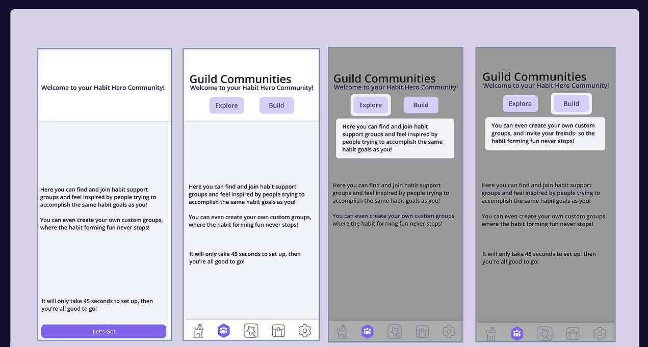
Community Feature
Habit Partner Community
Prototyping
These screens introduce the Community Guilds feature, encouraging users to join or create support groups.
Tooltips and CTAs guide users through key features under the "Community" tab.
These visuals aim to build motivation and user clarity before decision-making.


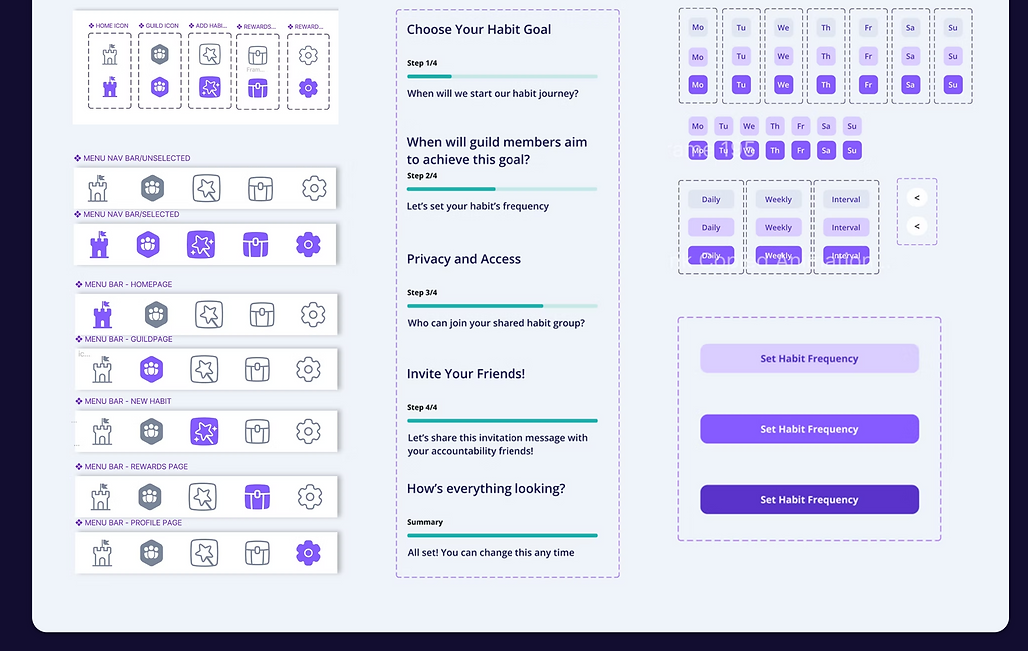
Component Design
As interaction patterns stabilised, I systematised the interface by creating reusable Figma components.
This established visual consistency, improved scalability, and supported efficient iteration across the product.
Core components included navigation structures, selection controls, feedback states, and layout containers, forming the foundation of a scalable design system.
Key Component Design System & Responsive States
Navigation Menu Icons States
Habit Onboarding Progress States
Habit Date and Frequency Selection States


Colour System
The colour system defines primary, accent, neutral, and gradient palettes, each documented with hex values and usage guidelines to ensure consistent implementation.
Primary brand colours establish identity and drive key interactions, supported by accent tones for informational emphasis and system feedback. Neutral colours form the structural foundation of the interface, from base surfaces to toggle and status states. Gradients add depth and visual continuity across key screens.


Typography
The typography system establishes a clear and consistent text hierarchy across the product, using Open Sans with defined size, weight, and line-height standards for each content role.
Heading styles structure page hierarchy and emphasise key titles, while body text variants support readability across core interface content. Distinct typographic levels are assigned to ensure visual consistency throughout the Habit Partner experience.


Business Implications
The findings suggest that social accountability has strong potential to improve sustained engagement and support Prime Care’s North Star metric of monthly active users.
By strengthening behavioural reinforcement, the feature may reduce drop-off, increase return frequency, and support long-term habit formation.
This provides a validated behavioural direction for future product development.


